Inspired by the data service provided by John Hopkins University, which is used by almost all data scientists in the world, IULI provides a dashboard to evaluate the situation of Covid-19 in 48 top severe experienced countries. This dashboard may be fetched at url http://og5.iuli.ac.id/covid.
The project was supported by IULI Data Science Research Group and Department of Computer Science, using a python pandas data frame, Google chart javascript and WordPress as presentation site. This suite gives the possibility for the group to see the Covid19 situation from a different angle.
Most evaluation is based on two dimensional charts, which show growth of cases on the vertical axis and magnitude of cases on the horizontal axis. This method gives us an interpretation of countries that are trying to reach zero growth, while maintaining low magnitude. This evaluation is divided into 3 clusters, based on the number of cases.
The other angle is to see the mortality v.s. the number of patients in the hospitals. It shows the performance of a country handling the patients. Mortality is calculated by dividing the number of death cases with the total number of patients exiting from the hospital. The presentation shows that all the counties have to reach the zero coordinate, which is zero mortality and zero patients in the hospital.
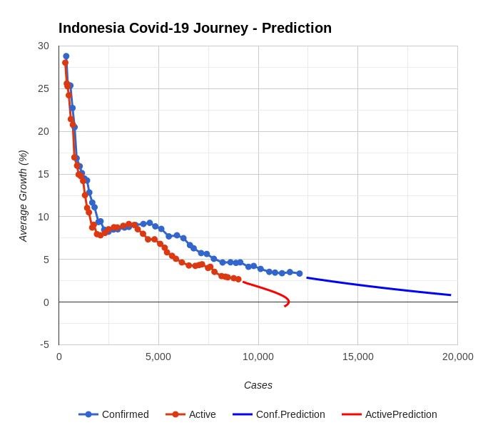
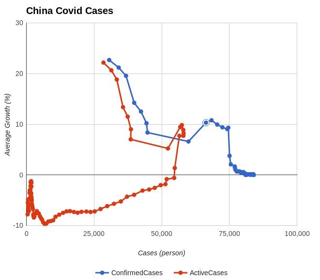
This project is also inspired by the terminology of “home run” in a baseball game. In this case, two series are displayed, which are confirmed cases and numbers of patients on the horizontal axis, while on the other hand, there is growth on the vertical axis. China shows a complete home run. Based on this, a rough prediction for the Indonesian journey is also presented. This prediction is based on the time series approach of confirmed cases of growth in confirmed patients and the number of people exiting from the hospital.